Brand Strategy and Identity for Australia’s first online Canelé bakery


Three brand logos were designed, including an icon. The first logo design embodies the spirit of a traditional family bakery in Bordeaux, while the second portrays the delightful Canelé with its golden crust and The third logo symbolises a luxury dessert icon and its sweet vanilla centre.


A tribute to Uncle Alain was paid through a portrait painting, honoring his invention of the Canelé recipe


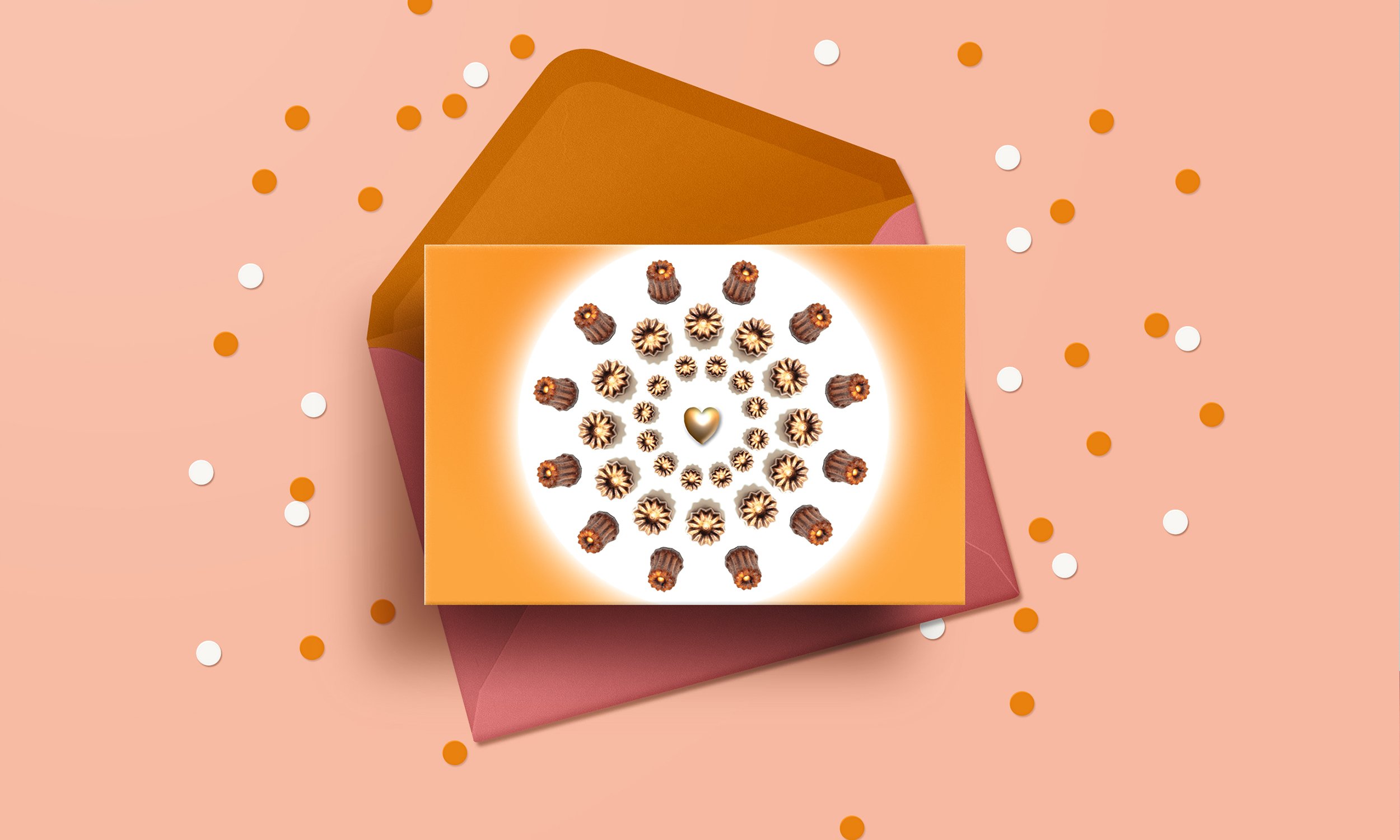
Postcards featuring Bordeaux's iconic architecture invoke the essence of the founder, a French architect turned baker, preserving the essence of France and cherished memories of this beloved treat for generations.


Seasonal avatars showcasing French dogs took the spotlight to captivate and engage the audience with the French theme.


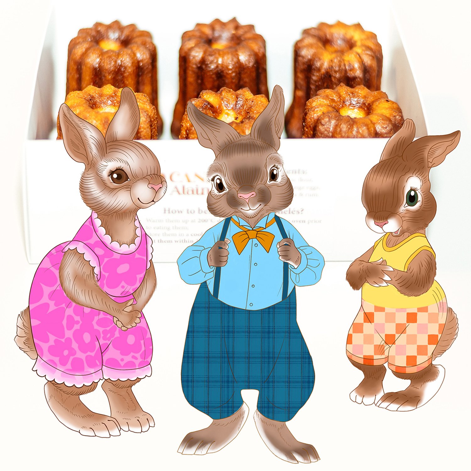
Colour is at the core of the new brand identity, with a meticulously selected palette of rich and muted shades. This palette extended to the illustrated characters created for seasonal promotions.


